If you create a strategy and turn it around, there are places where buying and selling occurs. I am reviewing when the sale occurs by saving it in an excel file. The big drawback of Excel is that you can't see the whole picture because you only see the numbers. You can also collect related data and draw a graph for viewing, but it has the disadvantage of taking a long time.
After executing the strategy, you can quickly see the strengths and weaknesses of the strategy if you can see when it was sold on the cadle chart. Like this. Here, P for profitable transactions and L for loss.
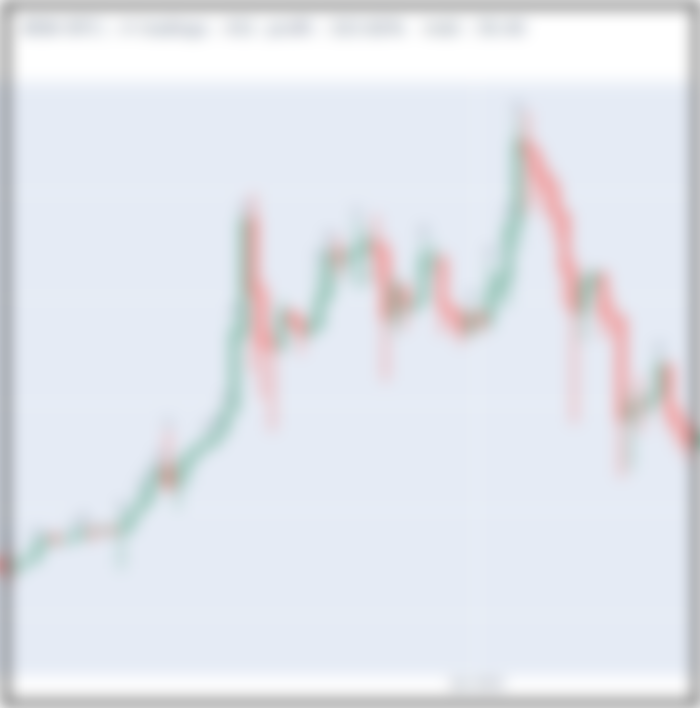
It would be very, very easy to see the results of the strategy turn right this way.
You can also see at a glance where you need improvement.
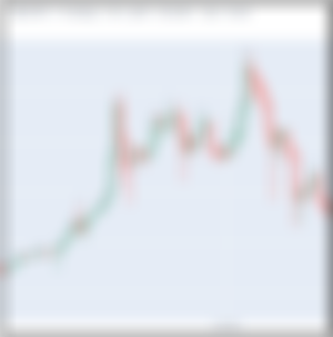
As shown below, there are many losses in the sideways market. Even if it makes a profit, it doesn't come out much.


In addition, even if the stock price is falling, there are many losses.

If you modify it so that you don't buy or sell during a sideways or decline like this, the yield will likely increase.
The relevant code is Larry_williams3.py in the link below.
https://github.com/multizone-quant/System_trading_ex/tree/main
Details on how to draw a chart are in the tistory below.