Amato - Beautiful Restaurant I Found Outside The City!!
Do you like watching the birds fly when you eat or do you prefer privacy during meals? Weird question, right? You may have noticed restaurants either have big open windows that look outside or else have the glasses covered up. The smarter ones play it safe by having them both.
Having a seat that faces the window or the wall is just as important as the food quality. Small things like a leaf for garnishing turns a simple dish into a mouthwatering fantasy. I stumbled upon a restaurant that really pushed my taste buds into "experiencing" more than "tasting" with its incredible interior design. Here is Amato.

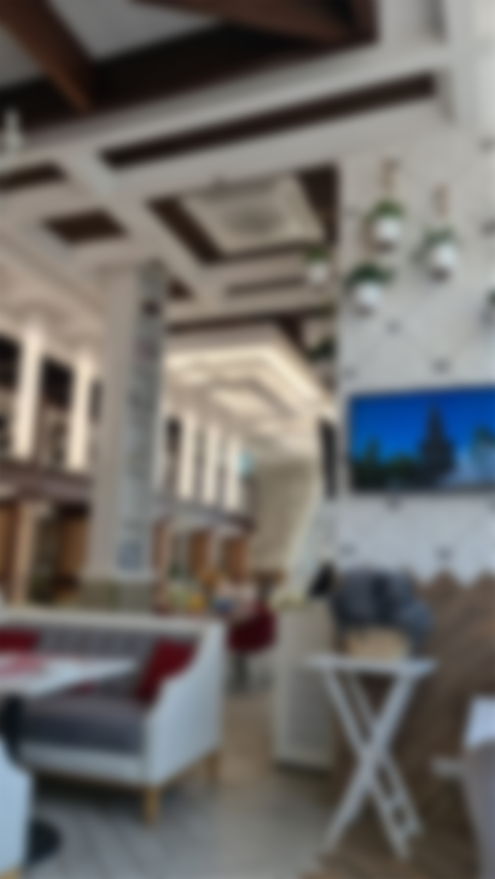
The first thing I noticed was how vast the restaurant felt. The place felt big and not constricting. It felt free. High ceilings and a common white-colored theme really helped establish that emotion. Initially, it felt minimalistic with the white chairs and pillars. Only after did I place my order I started to notice the well-designed chaos which filled this hall.
There is a coziness to this place. It was the comfortable chairs that reminded me of home or maybe it was the red checkered table cloth. A few seemingly scattered bookshelves littered the restaurant. It is well lit yet not too bright.


The continuous use of white both in furniture and design successfully pulled off the illusion of making this place bigger than it seems. It was perfect for someone like myself who likes open spaces. A freeing dining experience.
But Amato isn't minimalistic at all. Zigzag off-white tiles then turn into wooden tiles which line the ends of the restaurant. On one side the wall has a laid brick design and on the other end a plain white wall filled with white ceramic cutlery.
Seems like every inch of this place was carefully designed to keep the mind stimulated. The roof was a false ceiling with what looked like multiple layers. Brown ceiling with white accents. I really liked the use of shapes to make it so dynamic. Clever use of beams to create a simple geometric shape and make a clear way for the AC.
I really loved the disintegrated falling cube and the cylindrical hanging lights. They were very neat and nice to look at. The most I enjoyed was the view I had from my table.


I had a beautiful view of the main road from the full-height windows. Natural light filled my table. Right across was yet another wall that was beautifully designed to add to the homey cozy vibe. Plant pots, wax candles, lanterns, picture frames, and all the shebang.
It was like sitting in a living room on steroids. Very cozy and friendly atmosphere. I bet it took a lot of decision-making and trials to pull this off. The restaurant pushes a comfortable experience through its design itself.

Amato is a double stories restaurant. The ground floor is one side open and freely designed. The other side is lined with pillars with windows that provide a little more privacy. It has a more vintage touch to it. The same theme follows all the way to the top hall.
I believe design is very crucial. A single green leaf on top of a delicious curry makes it that much more appetizing, and a brilliantly designed restaurant makes the experience that much more enjoyable.


