 @rah
more from that month
@rah
more from that month
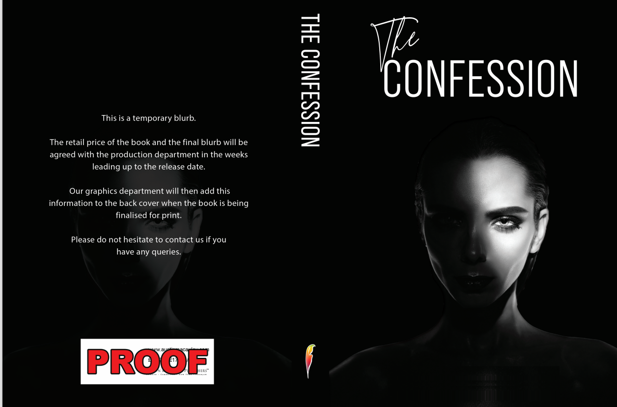
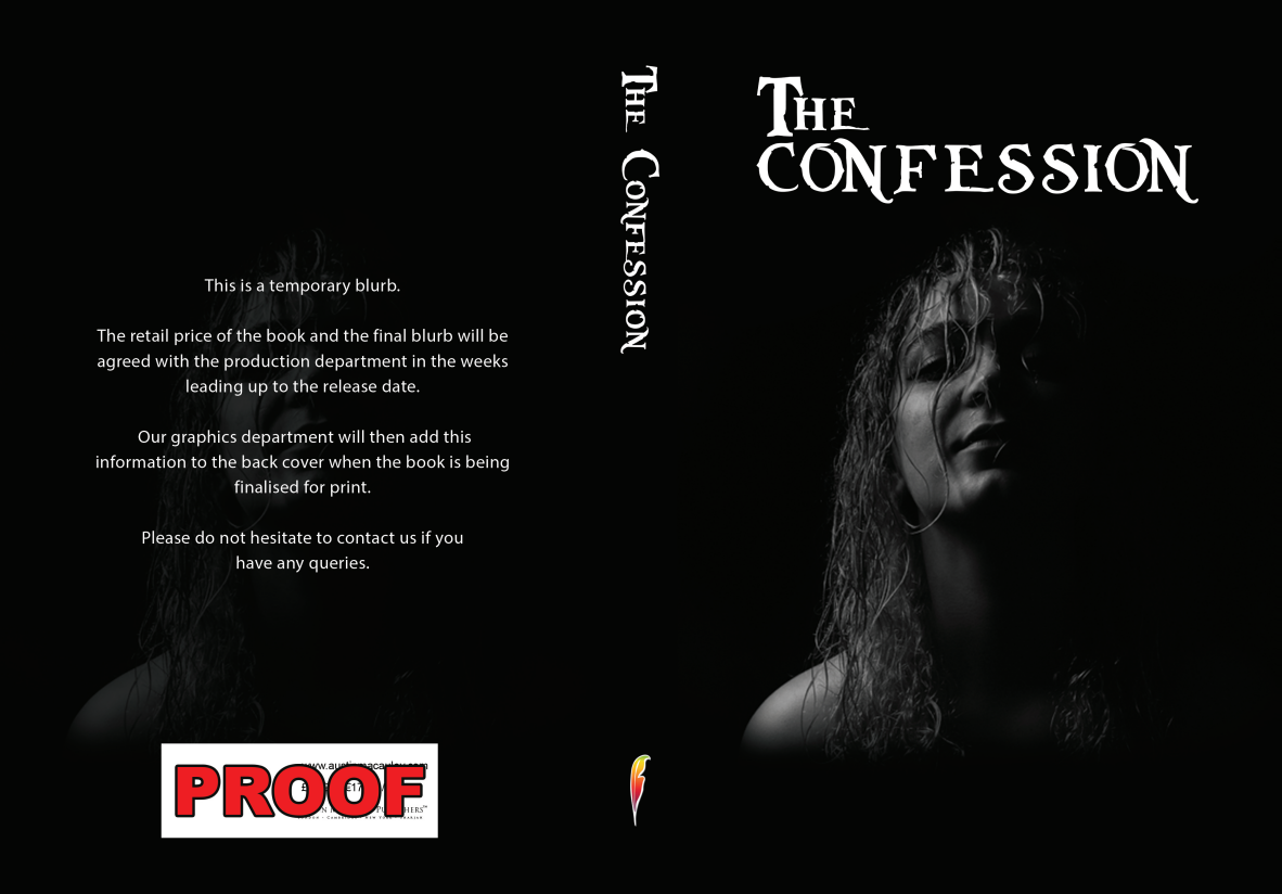
Just tried to post with two pictures but it wouldnt let. me. I didn't realise yesterday that I was provided with two draft cover designs. Which one do you prefer. I will try to put both in this post and it seems to have worked
3 comments
I like the font on the first one. With the pictures I like both faces equal :)
Oh, that's better... Version 1, with the black haired model seems to be the right one. Mysterious look, but the eye is great! Interesting face. Also it has better graphics to the title... So as far as I know, based on the nuggets you gave us... it's the best option. The second one with the curly hair, strange raised chin and with title font it's like a desaturated Teen/Young Adult book cover.... not ideal in this case. Thank you for sharing this! >D
The other one is nice but she is a bit too sophisticated to be the protagonist but I agree with what you said about the strange raised chin