 @codemojo
edited
more from that month
@codemojo
edited
more from that month
The sad fate of altcoins [visualized]

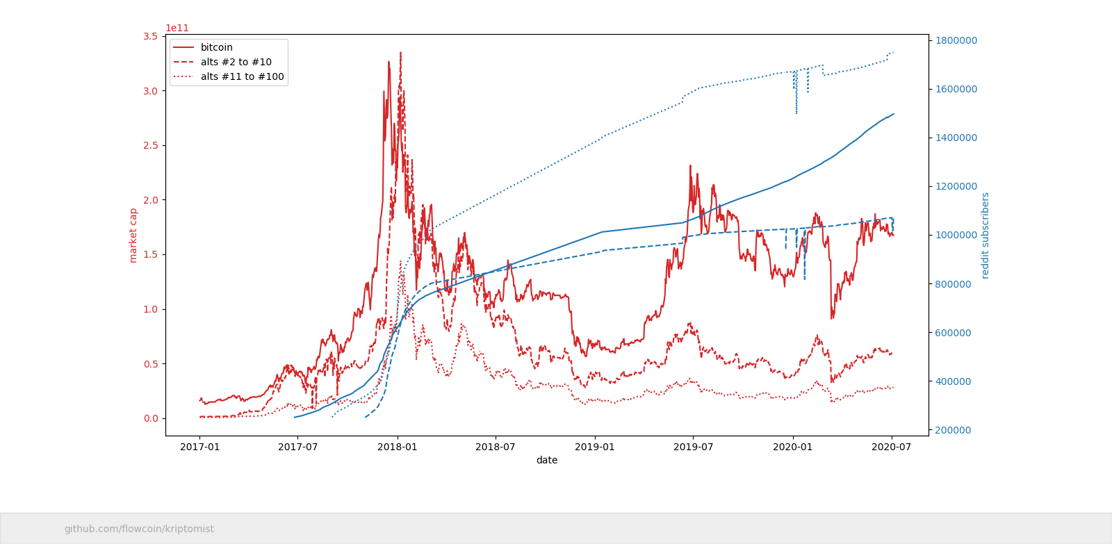
Market cap (red) It's no secret that altcoin prices are heavily correlated to bitcoin - especially when $BTC goes down. Looking at the chart above, the full red line represents bitcoin's market cap, dashed red line is altcoins positioned 2. - 10. and dotted red line is altcoins 11. - 100. Each time bitcoin tanks, it takes the alts with it. And when it soars the alts go up too. But, as seen on the chart above, they usually don't fully recover. Why is that so? I'm not sure, but it's possible that some traders sell their alts when bitcoin seems underpriced, to buy more BTC. Reddit subscribers (blue) The blue lines on the chart represent reddit subscribers. One thing to note about the subscriber count is r/Bitcoin's amazing growth in 2020. The curve looks almost as steep as it was in December 2017 when bitcoin price exploded. The big question Will it push bitcoin price up? I will try to answer that in the next article. Hint: the problem lies within bitcoin's small blocks and limited transactions they can carry.
1 comment
I found your article interesting... I think it's a few factors which I have mentioned before, but I think the big ones are Tether's involvement in price manipulation and wash-trading, and the ALT/BTC price coupling. As for Tether's involvement in price manipulation, it definitely does have an influence on why Bitcoin has outperformed many of the other cryptos. Yes, the liquidity is high, but it is not high enough to justify the difference in asset performance. As for price coupling, I think this one is really responsible for what has happened between "alts" and Bitcoin. People naively believe that Bitcoin is a safe haven asset and digital gold, so their mindset isn't to see the merit/tech behind other "altcoin" projects. They're mostly trading alts for BTC to stack up/gain more BTC. The effects of trade pair coupling have shown this effect over the years, but it definitely seems like other cryptocurrencies are starting to decouple from Bitcoin, and are even outperforming it. This took several years to happen, but it eventually did. Seeing how Bitcoin isn't very usable as a technology, and there eventually will be another spike in demand, it's only a matter of time before another coin with more value overtakes BTC. Though it hasn't happened YET, I have a sneaking suspicion that when a coin is on pace to flip BTC, there will conveniently be a bunch of whales intentionally dumping that coin so a "flippening" doesn't happen, and exchanges will also "conveniently" go offline. They can only suppress a more valuable coin for so long. It's a shame that we still have to deal with price coupling, because it has made the ecosystem stagnate as a whole for the last several years.