 @annoftheroses
Logo Making Entry 2 Good day everyone! This is my second entry to the logo contest by @Dolores . You can see other details from this link: **https://read.cash/@Dolores/make-your-own-logo-event-e1c60851**
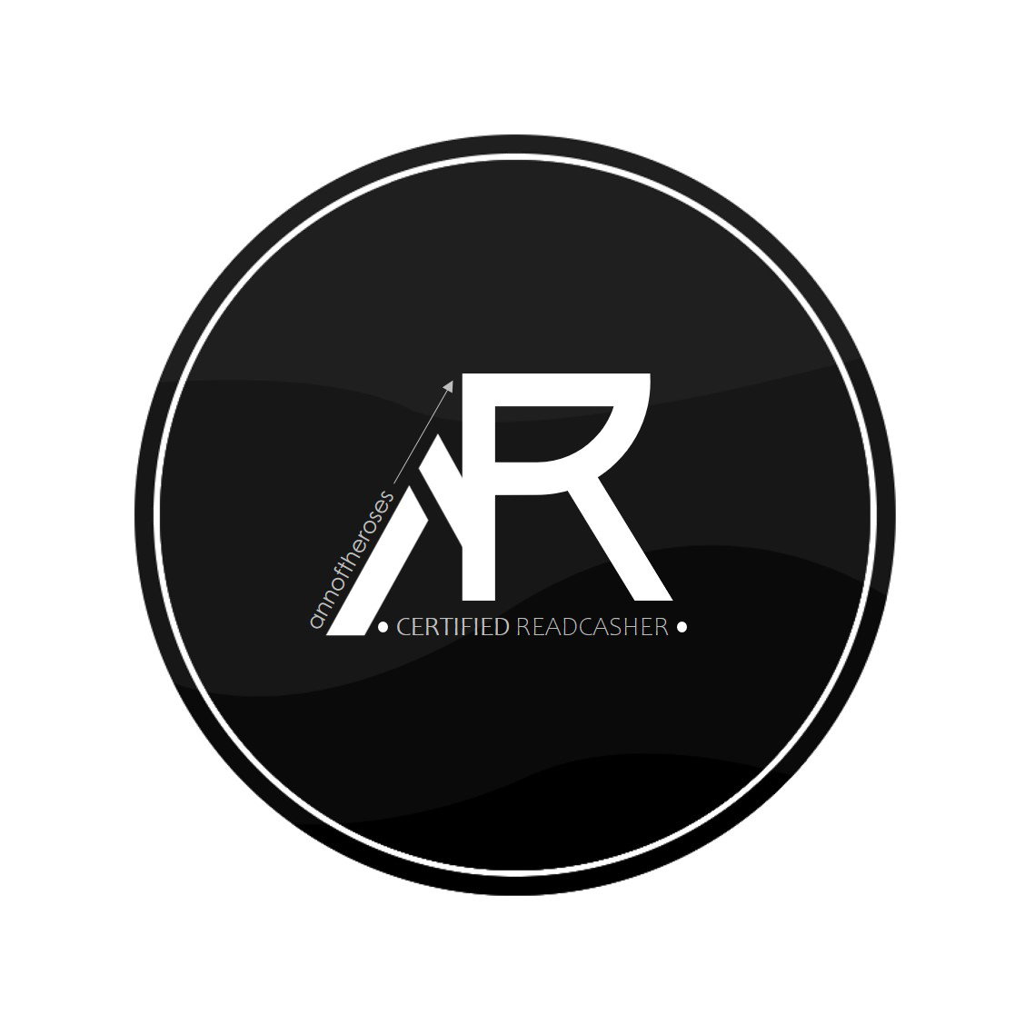
In contrast to the first logo I made, this is much simpler with my initials (A & R). You can see three main points: The A is lower than R because I want to emphasize on R representing the Read.Cash. There is an arrow going up to symbolize our growth as a writer, reader, and a Read.Cash member. The dots you can see beside the "Certified Readcasher" serve as the bitcoins that we are earning here. I used the font **Aquire** where you can download in **FontSpace.** And I used again MS PowerPoint to edit it.
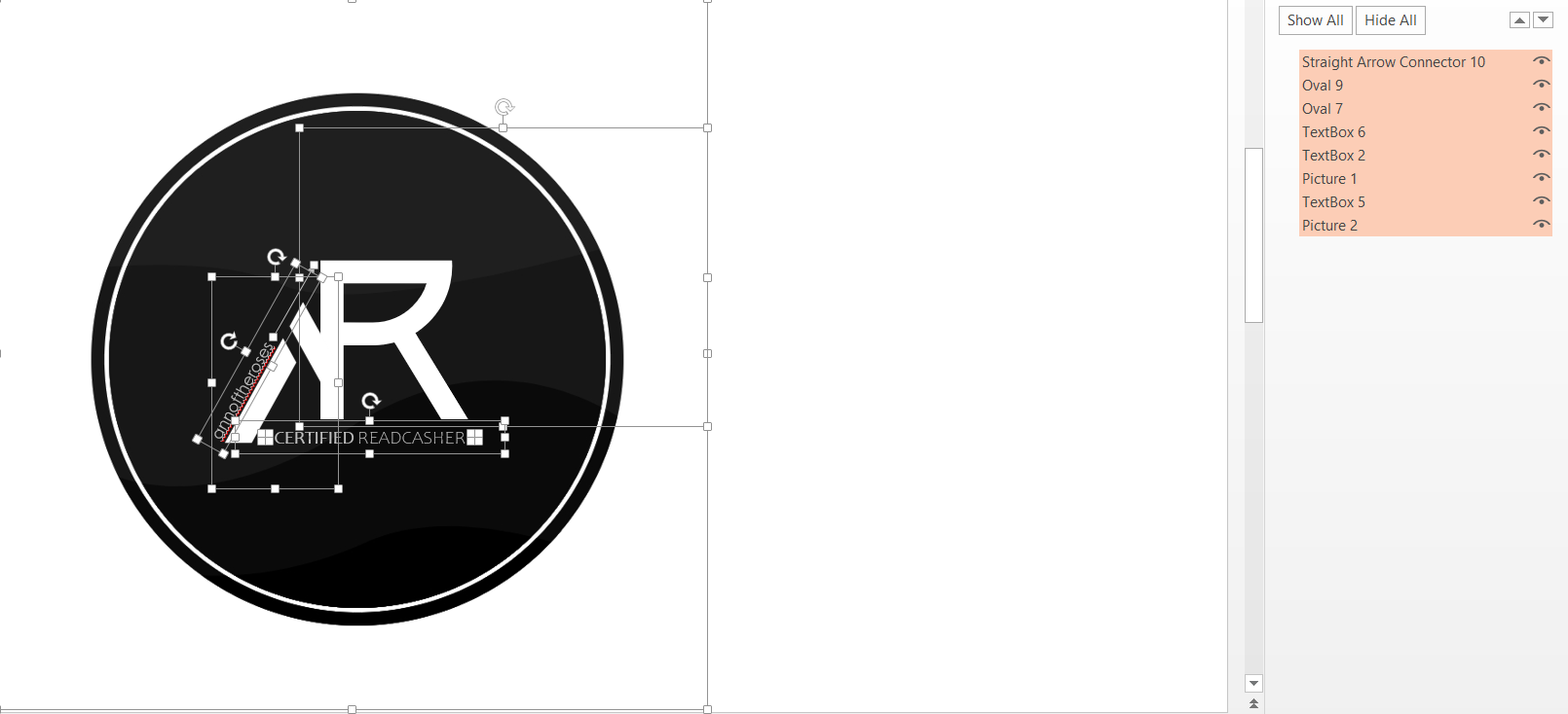
What do you think? *nervous intensifies Thank you for viewing and have a nice day! Thank you again @Dolores for this chance. It's still up to September 21 so you guys can still join :> I'm still thinking if I'm going to make the last entry.

1 comment
simple pero astig..ang galing naman balak ko din sumali sana pero mukang walang binatbat ang gagawin ko kesa diyan sa astig na ginawa mo..👏👏