 @MicroReylatos
more from that month
@MicroReylatos
more from that month
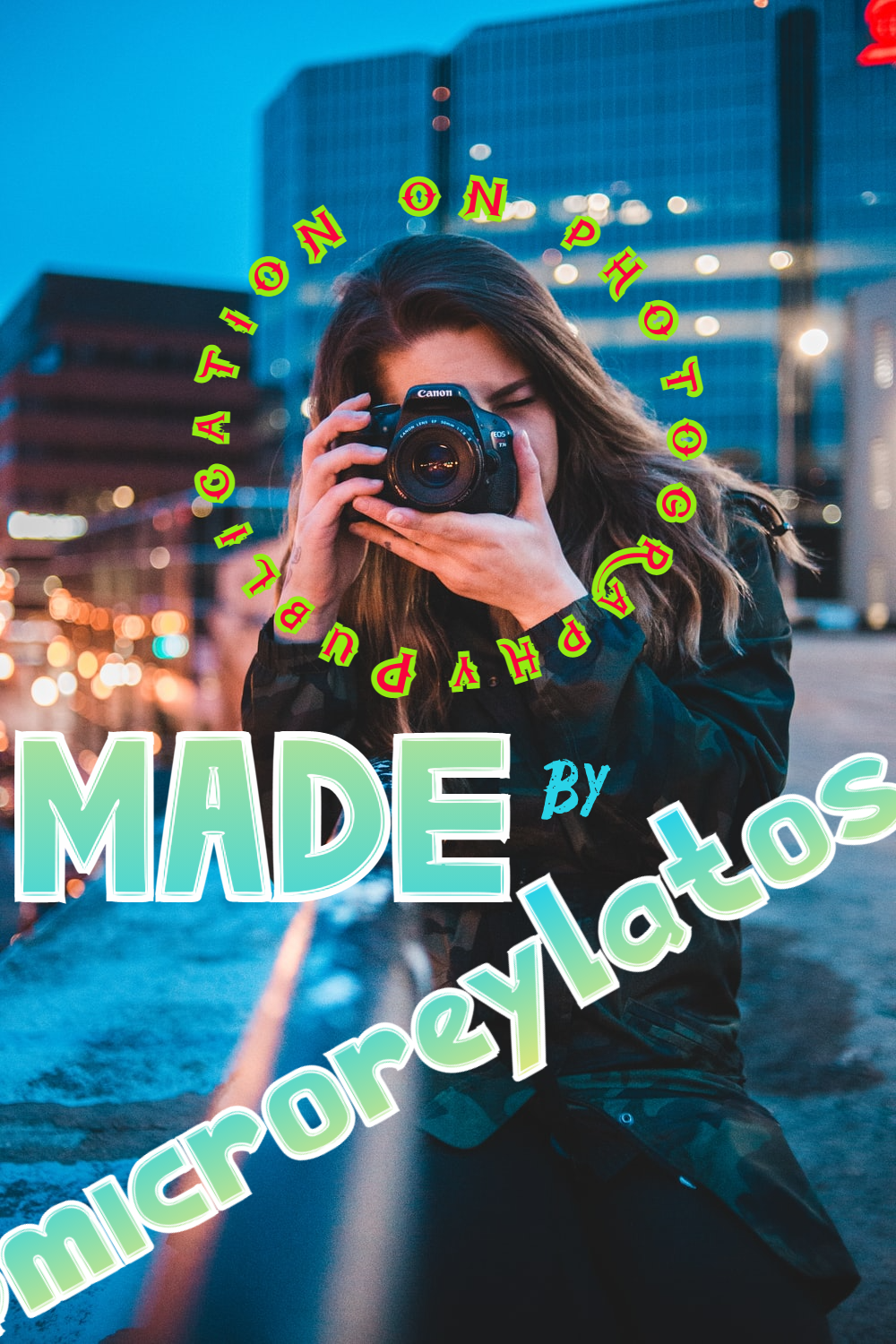
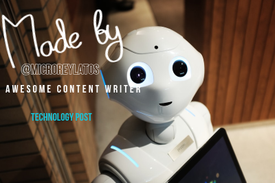
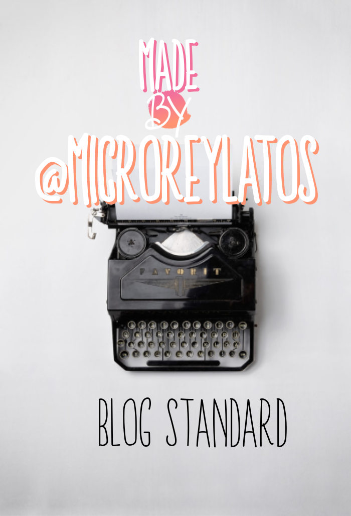
Creating a post is always a task that requires dedication, love and focus on the best way to deliver content to your audience. And an important part of the process is to make it attractive, for that you need several things, and I am going to talk about a couple of them today. Tools This is the most important thing to me, because using the correct software you can create wonders like the ones you see at the end of this post. And the main tool that I use is a graphics editing program. In my case, as I have a laptop and I do not have large storage capacities, what has been more efficient for me is to use online software, in this way I do not occupy my valuable hard disk space. And the software I use is called Pixlr, in its Express version that works wonders for me, because it has everything I need, and surely you will think the same when you try it. https://pixlr.com/e/#home There is an advanced and more complete version, you can also use it if you like, but I'm only going to recommend the Express version, which is lighter and does what we need. It is a graphic design software, in the best photoshop style and with the same tools, the difference is that it is super simple to use and very intuitive. Among other functions, it offers editing images, working with layers and being able to use a very large variety of styles and templates, as well as being able to create your own. Great right? When they explore it they will be amazed, other people prefer canvas, I really stick with Pixlr, I have been using it for years for all my content, and you can see how good my work looks. Using Google you can find many tutorials and guides to learn how to use it, and if you are graphic designers, this will be very easy for you and you will love this wonder. Images We must try to create images that are attractive, for this I recommend using photos that are in the public domain that can be found on pixabay, Unsplash or any of the other sites where they can use them anywhere without any inconvenience. Once they have selected the images, they must begin to place the text of their publication, and for this they must use layers (layers) and different types of letters that Pixlr already brings by default. You have many options, and if you wish you can incorporate a font that you like and this on your PC or on another page. Amazing, right? Read the next step so you know the best. Font We must use a font that is attractive for the thumbnail of our post, since it is what will be shown first when the reader sees our content in the index of sites such as read.cash, hive, steemit, blurt, etc. . It is recommended that it be a miniature of 400x400 as a standard size, you can try the one that works best for you. The font must be according to the topic of the publication, for example if its content is technological, futuristic, computer science or blockchain, it is appropriate to use a font according to it. For publications of stories, stories and blogs in general, more relaxed letters such as Arial, comic Sans, etc. are used. This is to the taste of the consumer. The important thing is that they can color the letters, manipulate the size, and Pixlr comes with templates by default. And below you can see 3 examples that I have created especially for this publication. I'm not a graphic designer, and look what I can do! So get to work and follow these mini recommendations, which I hope will guide you to improve your publications! - And then when they try it, they tell me what results they have had, so that everyone can learn that it gives better results. If you want to learn or improve the quality of your content, then this chamber is for you: https://noise.cash/n/theworldofreinaldo --------------------------------------- Crear una publicación siempre es una tarea que requiere dedicación, ponerle cariño y enfocarse en la mejor forma de entregarle el contenido a tu audiencia. Y una parte importante del proceso es hacerla atractiva, para eso necesitas varias cosas, y te voy a hablar de un par de ellas en el día de hoy. Herramientas Esto para mí es lo más importante, pues usando el software correcto puedes crear maravillas como las que ves al final de esta publicación. Y la principal herramienta que yo uso, es un programa de edición de gráficos. En mi caso como tengo una laptop y no poseo grandes capacidades de almacenamiento, lo que me ha resultado mas eficiente, es usar un software online, de esta manera no ocupo mi valioso espacio de disco duro. Y el software que uso se llama Pixlr, en su versión Express que me funciona de maravillas, pues tiene todo lo que necesito, y seguramente ustedes cuando la prueben pensaran lo mismo. https://pixlr.com/e/#home Existe una versión avanzada y más completa, también la pueden usar si es su gusto, pero yo solo voy a recomendarles la versión Express, que es más ligero y hace lo que necesitamos. Es un software de diseño gráfico , al mejor estilo de photoshop y con las mismas herramientas, la diferencia es que super simple de usar y muy intuitivo. Entre otras funciones ofrece el editar imágenes, el trabajar con capas y el poder usar una variedad muy grande de estilos y plantillas, además de poder crear uds las propias. ¿Genial Verdad? Cuando lo exploren se van a quedar asombrados, otras personas prefieren el canvas, yo realmente me quedo con Pixlr, lo vengo usando hace años para todos mis contenidos, y ya ven que bien me quedan mis trabajos. Usando Google pueden encontrar muchos tutoriales y guías para que aprendan a usarlo, y si son diseñadores gráficos, esto será muy fácil para uds y amaran esta maravilla. Imágenes Debemos intentar crear imágenes que sean atractivas, para ello recomiendo usar fotos que sean de dominio público que se pueden encontrar en pixabay, Unsplash o cualquiera de los otros sitios donde pueden usarlas en cualquier parte sin ningún inconveniente. Una vez que hayan seleccionado las imágenes, deben comenzar a colocarle el texto de su publicación, y para ello deben usar capas (layers) y distintos tipos de letras que ya el Pixlr trae por defecto. Tiene muchas opciones, y si lo desean pueden incorporar una fuente que a uds le guste y este en su PC o en otra página. ¿Asombroso, Verdad? Lee el próximo paso para que sepas lo mejor. Tipo de Letra Debemos usar un tipo de letra que sea atractivo para la miniatura de nuestro post, pues es lo que se va a mostrar en primer lugar cuando el lector vea nuestro contenido en el índice de sitios como read.cash, hive, steemit, blurt, etc. Lo recomendable es que sea una miniatura de 400x400 como tamaño estándar, uds pueden ir probando el que mejor les resulte. El tipo de letra debe ser acorde al tema de la publicación, por ejemplo si su contenido es tecnológico, futurista, de informática o de la blockchain, lo apropiado es usar un tipo de letra acorde a ello. Para publicaciones de relatos, cuentos y blogs en general, se usan letras más relajadas como la Arial, comic Sans, etc. Esto es a gusto del consumidor. Lo importante es que pueden colocarle color a las letras, manipular el tamaño, y el Pixlr trae plantillas por defecto. Y abajo pueden ver 3 ejemplos que he creado especialmente para esta publicación. ¡Yo no soy diseñador gráfico, y miren lo que logro hacer! Así que pongan manos a la obra y sigan estas mini recomendaciones, que espero les sirvan de orientación para mejorar sus publicaciones!- Y luego cuando lo prueben, me comentan que resultados han tenido, para así todos poder aprender que da mejores resultados #TheWorldofReinaldo
No comments yet