When most traders take the price trend for granted, the market reacts the opposite way. Often prices drop very fast and while volatility helps some traders gain by buying the dip, most times it creates big profits for derivative exchanges by liquidating positions.
Each line drawn in a chart is an equation with dozens of variables that most traders usually don't understand or skip completely.
I wrote another article on some things we need to avoid when trying to understand this market. In my previous article: The Pro Traders and Trading Courses I explain how we can get in trouble and pay for subscriptions and courses from some self-proclaimed professional day-traders that are ripping off newcomers.
Real traders don't sell courses. Some of them are also kind enough to share their findings and charts, however, only a handful of them have managed to predict the market trends and prices correctly, with a scientific approach.
In this post, I will try to explain two charts I have been following, one for many years, and one recently.


Trolololo Chart (2014)
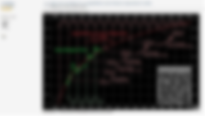

Source: Bitcointalk forum
I found this one in 2017 when looking into BTC charts for hours daily. The chart is based on price data until 2014 and gives a logarithmic equation that displays the trend of BTC price.
This chart predicted the price of $10,000 for Bitcoin in 2017, with great accuracy. I remember watching the chart and waiting for the 10k mark in '17, and while I am not sure, I think it was very close to November, 22nd and missed by just a couple of days.
It also predicts that BTC price will reach 100k on July, 16th, 2021. This is less than three months away, and I have many reservations it will reach there, even though the BTC price is currently above $50,000 and has even reached an all-time high close to $65,000.
The S2F chart by the trader named "PlanB", is mostly based on this one, which is the real deal. PlanB just created a chart with similar results and tried to rationalize that the halving pushes adoption, which is a weak argument without any point. The halving is weakening supply instead of increasing demand and adoption. Demand will stay the same and the halving itself doesn't increase "adoption". Network adoption of BTC is not the same as the increase of speculators entering to buy high and sell higher. This is FOMO and gambling, not adoption. Maybe PlanB should rephrase that the halving creates better gambling conditions. However, I doubt he ever uses BTC for anything else but speculation and any gambler may think that this is what adoption means.
The Trolololo chart is pure math, but as all charts predicting prices, it can fail.
BTC has been proven to be an inadequate network and everyone entering today is up to a big surprise of fees having reached $60 and a community that doesn't have any clear direction. BTC is not disruptive anymore and everyone becomes aware of the weaknesses it has sooner or later.
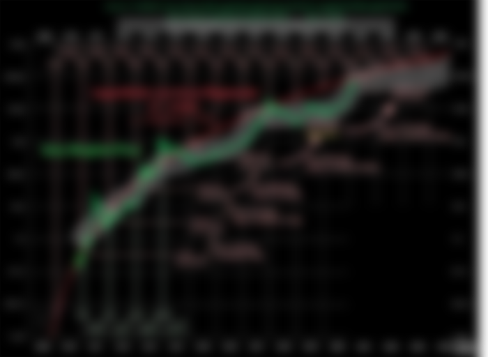
Updated Version by CharlesBTC
In my opinion, this chart is another proof that BTC has failed. It correctly predicted the 10k price of 2017, and maybe the price will reach 100k, however, we can observe how far below the regression line BTC price is trading.
Other cryptocurrencies are catching up and have better technology. The BTC dominance is dropping as faith in the network has been lost and investors are now eyeing other potential disruptive cryptocurrencies. This chart is convincing me that even at $65,000 it was accurate enough and maybe $100,000 will not be possible for BTC. But it is up to whales to decide. If they teamed up to sell in July or August, a price of $200,000 is probably within reach.


RHODL Ratio (2020)
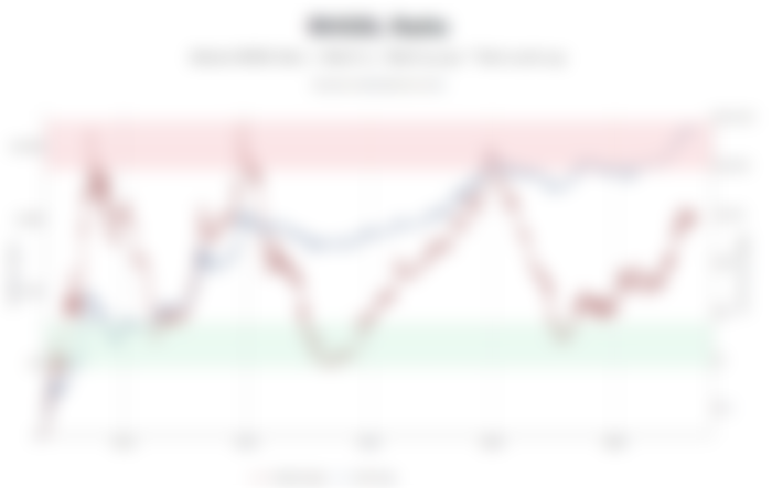

Source: LookintoBitcoin
This chart was created by Philip Swift.


According to the author, this chart gives us exact levels for the overheated BTC price levels level and prices for a decent entry point.
The blue line represents the price action of BTC on a logarithmic scale.
The red line is the RHODL Ratio
The RHODL chart provides us with the entry and exit points for our long-term trades on BTC. It gives the best price to buy when the RHODL line is in the light blue zone, and sell when it reaches the red zone.
The RHODL Ratio is explained better in this medium post.
It is combining two other indicators:
HODL Waves and
MVRV Ratio (Market to Realized Value)
It indicates that the BTC price is probably somewhere in the middle of the bull run when we take into consideration the three previous tipping points on the chart, it gives the impression that BTC is supposed to keep rising for probably another three months.
It is a chart that is recently created and some traders see it having great potential for the BTC technical analysis.
Final Thoughts
Both charts point for the price of BTC to keep rising. There are counter indicators that appear at these levels and maybe we are still in the middle of the bull run, or close to the end of it.
If Bitcoin imitates the previous two bull runs it could reach $200,000 before validating these two charts.
The "trolololo" chart is a popular one for crypto-traders because it accurately predicted the date BTC reached $10k. Also, the RHODL ratio seems reasonable and gives a very good picture of entry and exit points for our long-term trades.
As the price of BTC keeps rising the risk is also increased and the possible reward is reduced. The higher the price is in these two charts, the more difficult and speculative our trades become.
Also, the current price action is limiting this investment period, as getting in right now with a long-term plan (2-3 years) could be dangerous for the profitability of this investment.
For BTC, the last eleven weeks have not been as bullish as the previous year, and while it made new ATH two times in this timeframe, it failed to keep rising parabolically.
While BTC is still the top selection for investors, this can soon change as other blockchain networks like Bitcoin Cash are expanding and increasing in real adoption levels for the utility of their networks and not just for speculation. There will be mechanisms that will decouple the price of Bitcoin Cash from BTC and with time the market will not depend on just one cryptocurrency that has failed to scale.
Lead Image from Unsplash (by Chris Liverani)


Currently active on the following networks: