 @IgorBelykh
more from that month
@IgorBelykh
more from that month
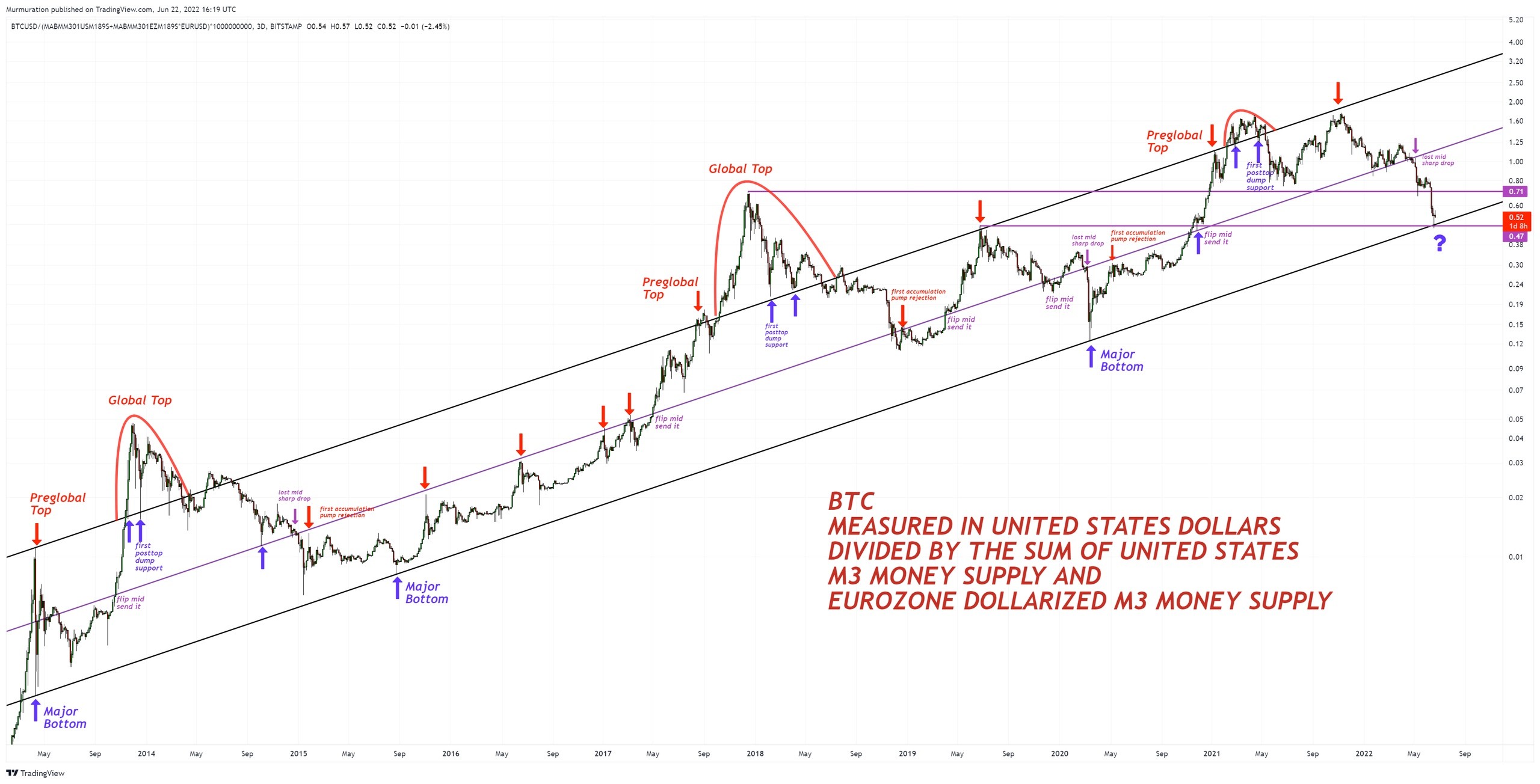
The most consistent long-term chart I've found in all of cryptocurrencies. BTC Measured in US dollars divided by the sum of the M3 money supply in the US and the M3 money supply in the EU (in dollar terms). In other words, adjusting BTC price behavior by expanding the broadest aggregates of the money supply.
2 comments
Can you show us the link where we can zoom in on different periods with more detail?
You can download this graph form my site https://disk.yandex.com/i/j3sVPrxbOAVbuQ Download it and zoom. If you want to read it online it shows blurry graphics