 @Carewind
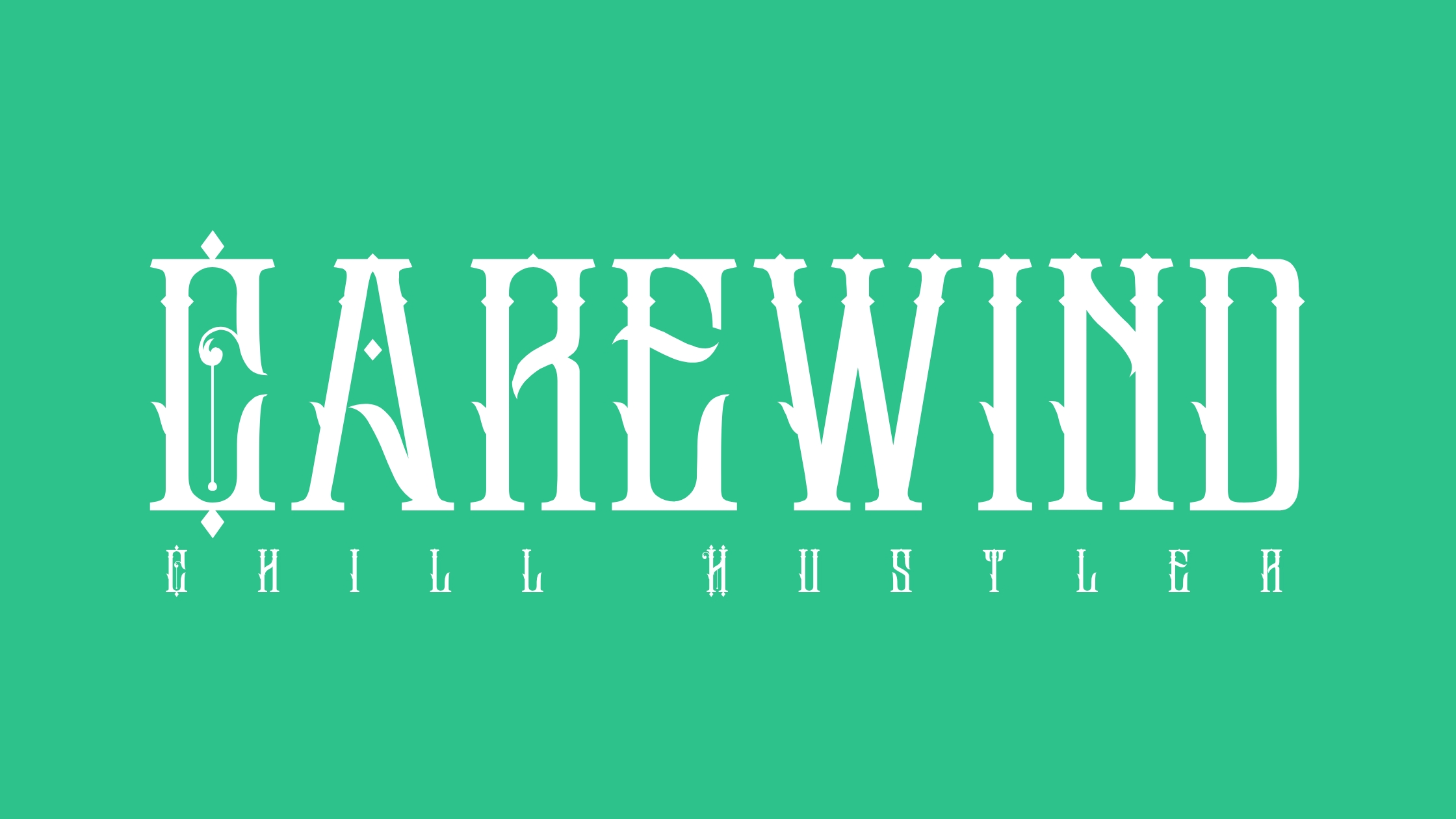
I was bored so I decided to make a new logo for my blogging journey noisefam but ended up having a hard time deciding what's more appealing to the readers eye. Is it the green background or the white one. So, I'll ask everyone who sees this for your choice noisefam. Hehe

7 comments
Wow that's really a nice one . Keep the creativity up
Thanks for appreciating friend.
Less edges more rounded letter. My two sats. Although, what is a "chill hustler"? It might be important for the design. The concept of your blog will be something related to horror? In this case it matches well.
Thanks for your idea idol, chill hustler is more of a nickname for my side hustle, like I don't really stress about it but I still hustle. Hehe I prefer more edges just to make it look more cooler for me. But I'll take it for consideration. Hehe
Ah ok. I like edges but I think it makes the logo a little aggressive. However, this is all up to you and what you like!
I think the second one looks more nice.
That's my choice too. Hehe